Southeastern Free Will Baptist College
From pitch to launch: a website redesign, an accessibility specification, and what happened between the spec and the build.
At a glance
- Problem
- The college's site had to win prospective students and their parents, and its main path for them, Learn More, ended at a request button that did nothing.
- What I decided
- I redesigned the site mobile-first around those two audiences, wrote an accessibility specification for the build, and cut testimonials from launch scope rather than hold the timeline for content that didn't exist yet.
- Result
- Designed and launched, with a spec-to-build gap. Most of the design shipped. Much of the accessibility spec was lost in the build, and with tracking never set up, the impact is unmeasured.
| Client | Southeastern Free Will Baptist College, Wendell, North Carolina |
|---|---|
| My role | UX (user experience) consultant through Upstream XD: discovery, usability audit, pitch and roadmap, analytics baseline, information architecture, visual and interaction design, accessibility specification, content strategy |
| Built by | A separate engineer |
| Platform | WordPress, custom theme |
| Timeline | Pitched . Analytics baseline . Target launch . Launched between late May and early . |
| Live site | sfwbc.edu |
What I designed, and what launched
I redesigned the public website for a small ministry college. I ran the audit, set the analytics baseline, and designed the information architecture, the homepage and page templates at desktop, tablet, and mobile, and every navigation menu. I also wrote an accessibility specification for the header, footer, and templates. A separate engineer built the site in WordPress.
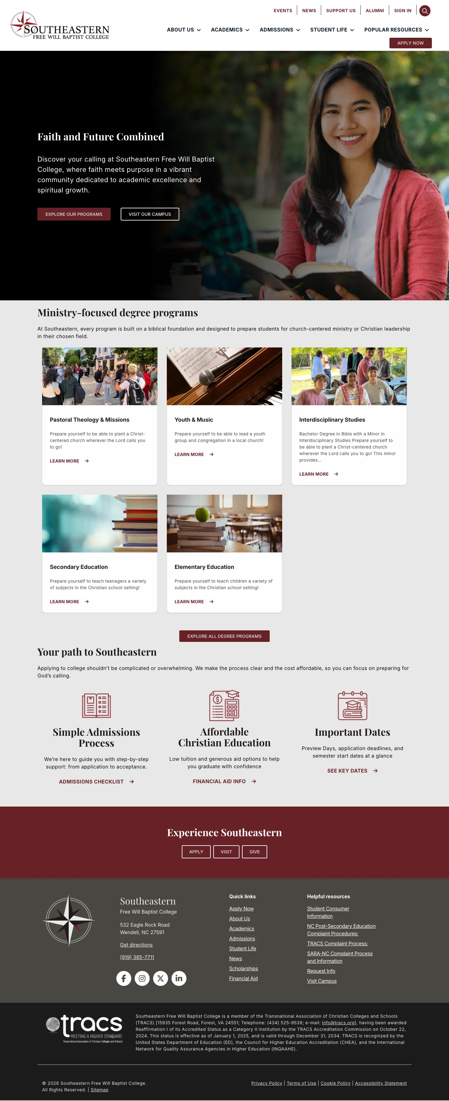
It launched in late spring with most of the design intact: the hero, palette, typography, program cards, and admissions cards. This case follows the project from the pitch to the live site, and ends on what I learned about the step between handoff and launch.
The problem
Southeastern is a small ministry-focused college. Its site has to serve students who are asking “do I belong here?” and parents who are asking “is this worth it, and how does it work?”
Auditing the old site
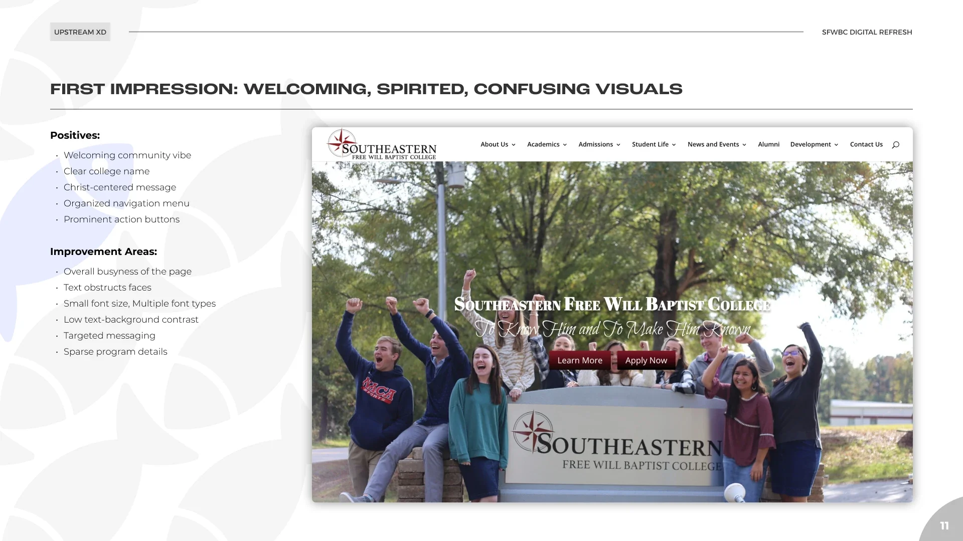
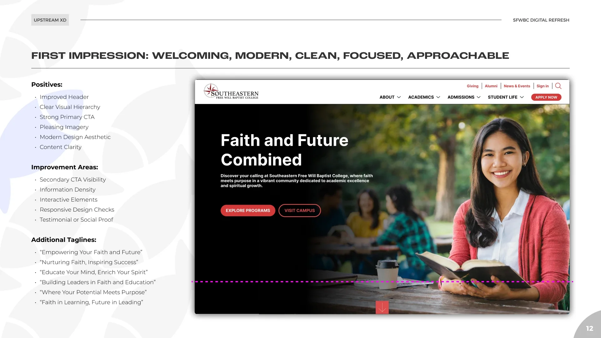
I started with a first-impression review of the existing homepage. It felt welcoming and clearly Christ-centered, with an organized menu and prominent buttons. It was also busy, with text placed over faces, small type in several typefaces, low text-to-background contrast, and thin program details. Accessibility problems were on the list from the first review, before any design work started.
A crawl found 198 pages, 92 of them with public-facing content. That count set the scope for templates and content migration.
 (opens full size in a new tab)
Walking the journey
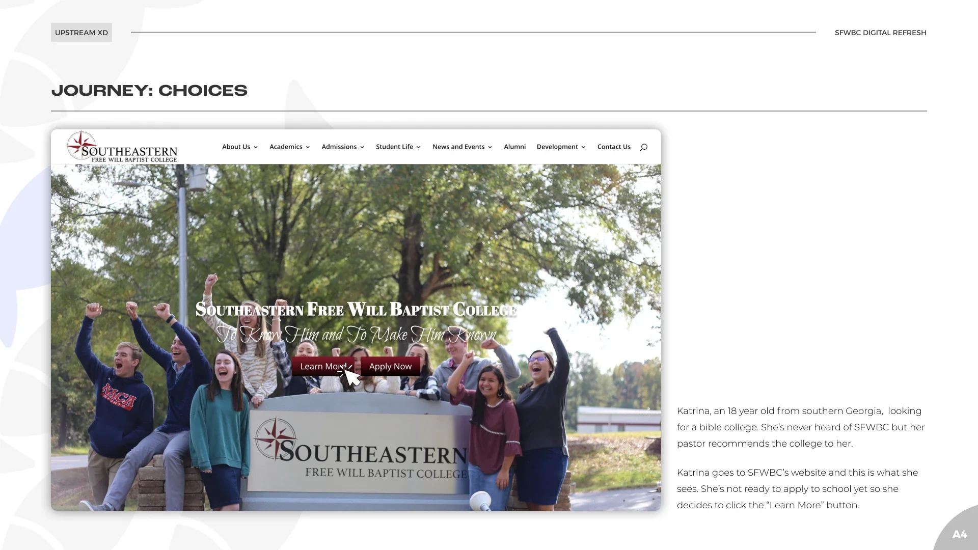
To make the problems concrete for the college, I walked the site as a protopersona: Katrina, an 18-year-old high school senior whose pastor recommended Southeastern. A protopersona is built from assumptions to be tested later, not from research, and I presented it that way.
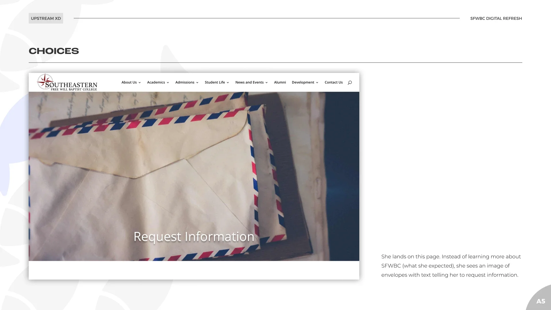
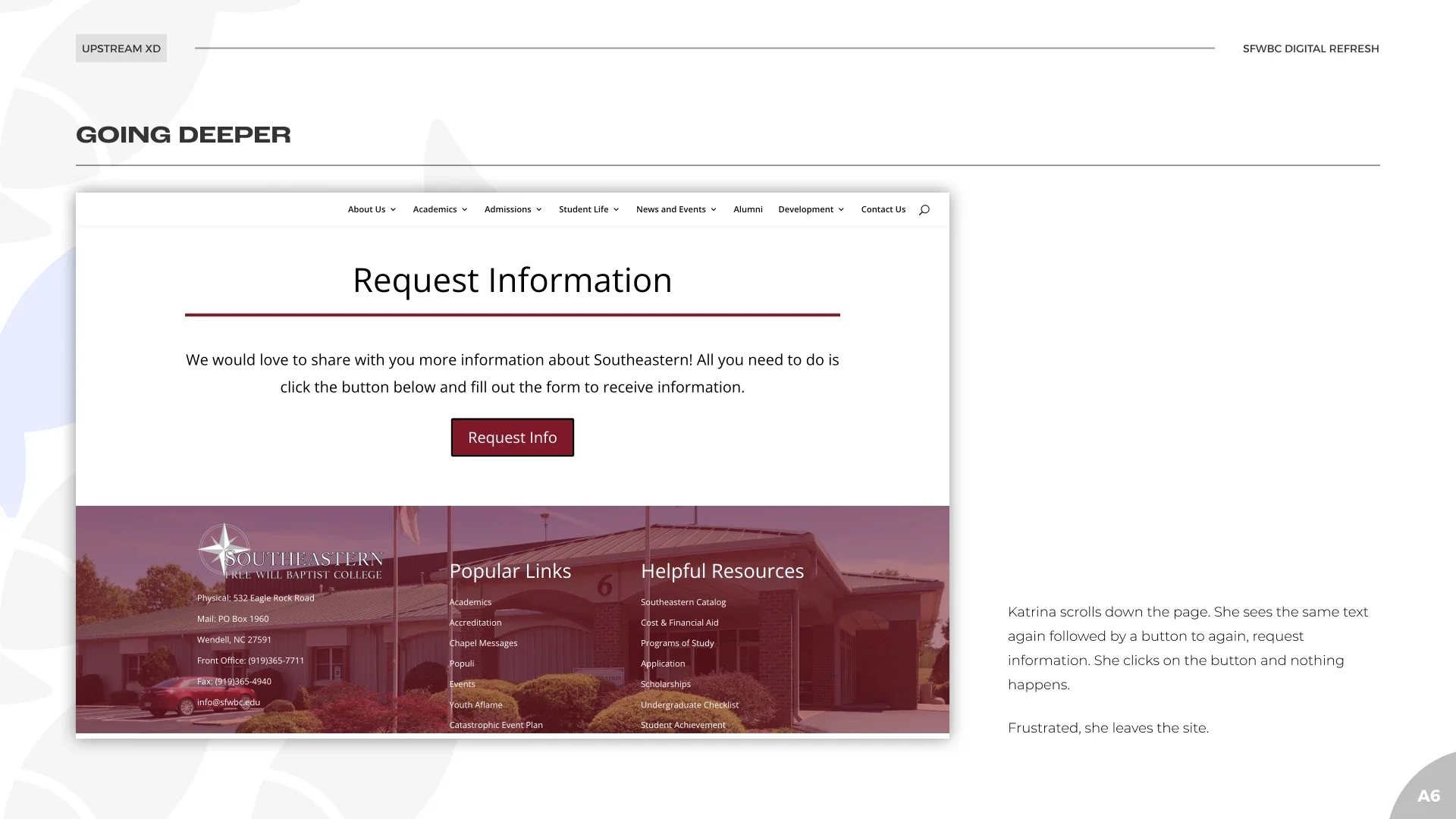
Katrina isn’t ready to apply, so she clicks “Learn More.” Instead of program information, she lands on a page about requesting information. She scrolls, finds a second request-information button, and clicks it. Nothing happens. She leaves.
Who the site serves
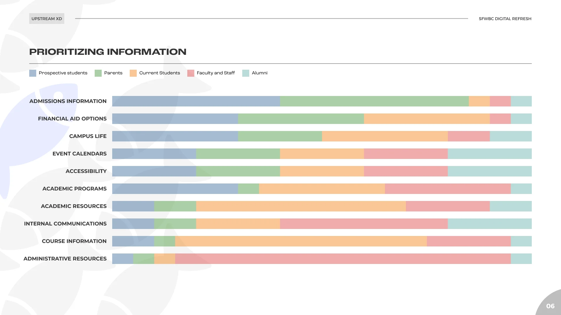
I mapped five audiences (prospective students, parents, current students, faculty and staff, alumni) against the information each one needs. Current students and staff visit most often, but prospective students and their parents are the ones the public homepage has to win. That set the priority for the redesign.
 (opens full size in a new tab)
Pitch and plan
I pitched a three-phase roadmap: stabilize and prepare (usability fixes, templates, content migration, analytics setup), research and analysis (surveys, interviews, analytics review, stakeholder workshops), then iterate and scale (feature refinement and testing).
Phase 1 was completed: my usability audit and templates, content migration by the engineer, and analytics setup. Phases 2 and 3 were suspended. The surveys, interviews, workshops, and testing in the plan never happened, and nothing in this case comes from them.
Setting a baseline before designing
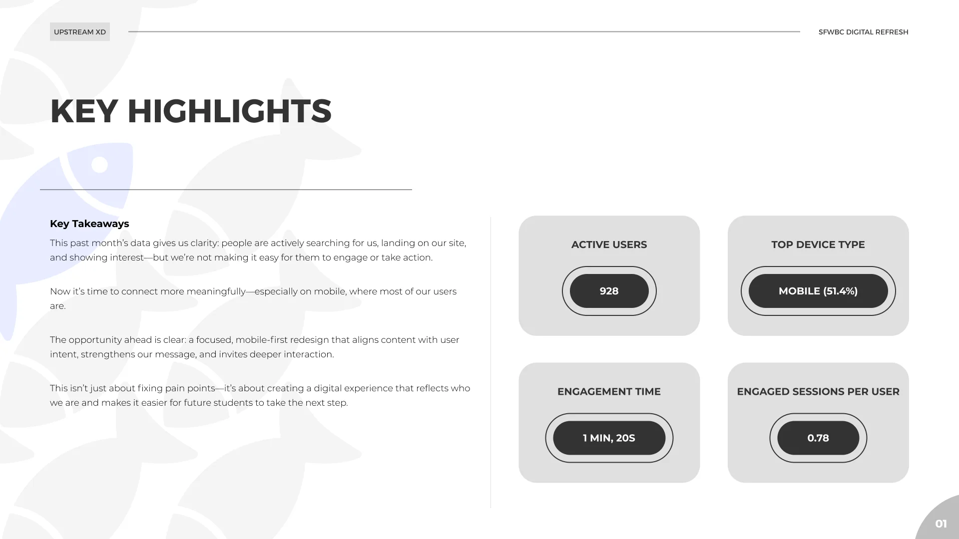
In , before the redesign, I delivered an analytics baseline so the project would have something to measure against:
- About 51% of visitors were on mobile.
- Average engagement time was about 1 minute 20 seconds.
- Engaged sessions per active user was 0.78.
- Very few visitors took a next step such as starting a form.
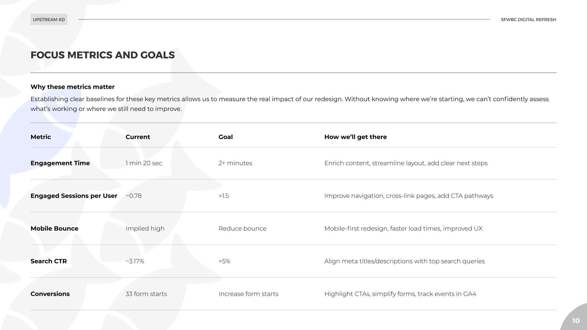
I set targets for each and listed the next steps: mobile-first design, reusable templates for programs, faculty, and admissions, a homepage with clear paths to Apply, Visit, and Learn More, search-aligned page titles, and event tracking on forms and buttons.
The data also showed heavy traffic from Ashburn, Virginia. Ashburn is home to a large concentration of data centers, and that traffic is mostly automated. I flagged it as something that distorts every engagement number and recommended filtering it out.
Design
From first version to final
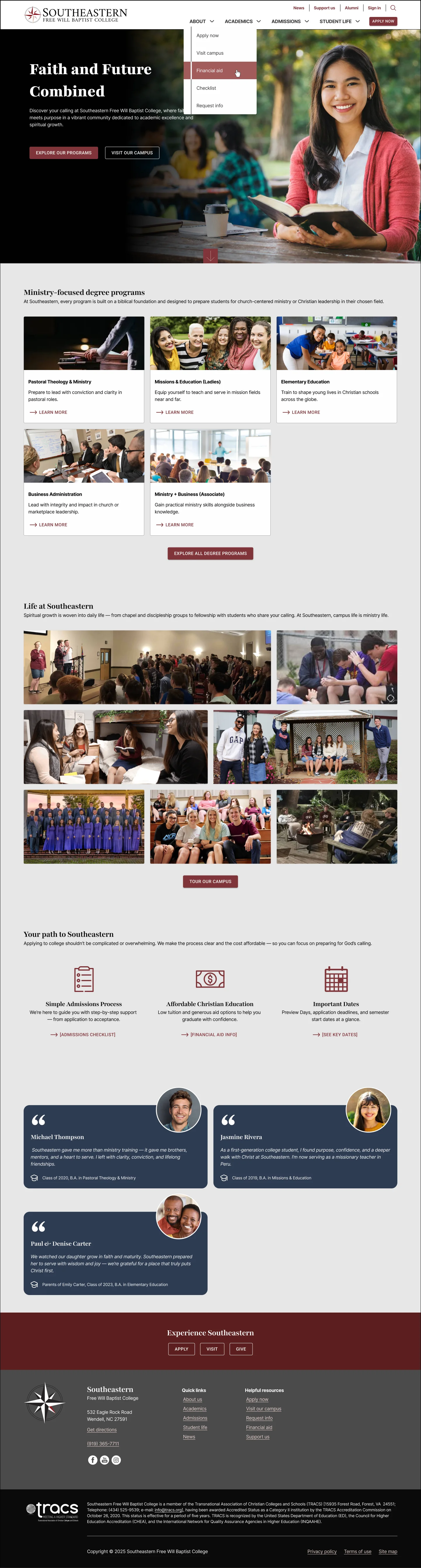
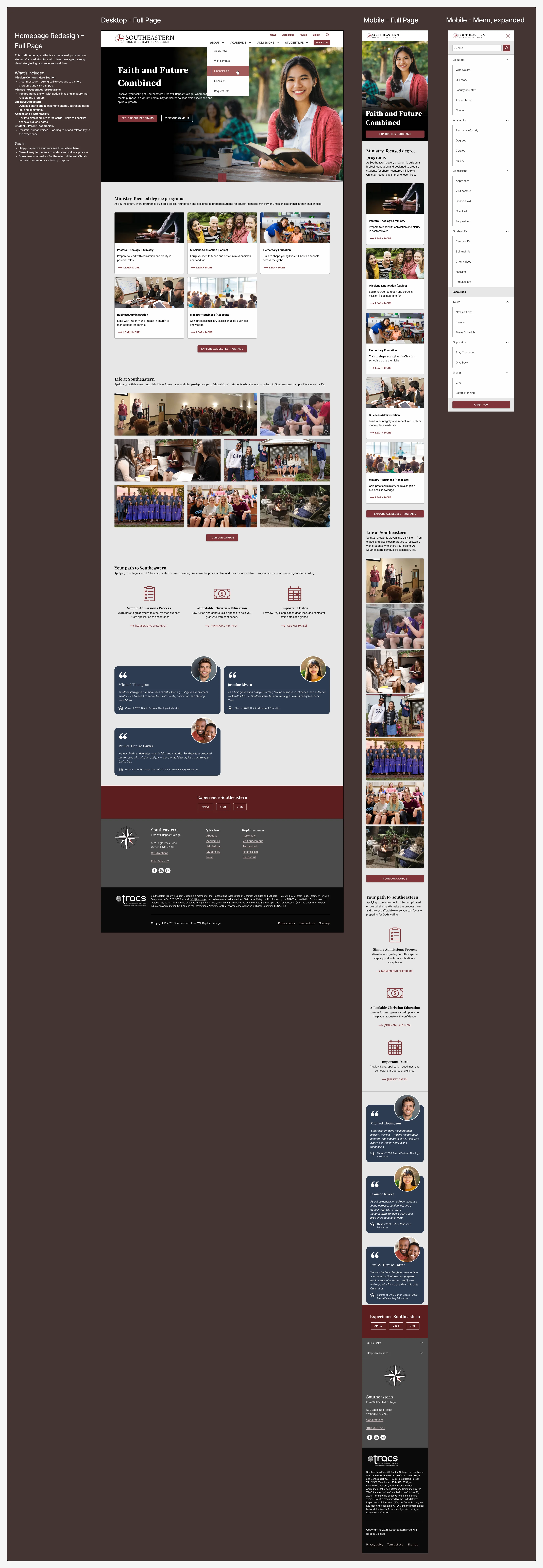
My first homepage version fixed the header, hierarchy, and primary call to action. Then I reviewed it the same way I’d reviewed the old site and listed what it still needed, including more visible secondary actions, responsive checks, and social proof. The final design added full mobile layouts and a section of testimonials from students and parents. The testimonials were cut from scope on , to hold the timeline (see “What we cut to hold the timeline” below).
Decisions that trace to the data
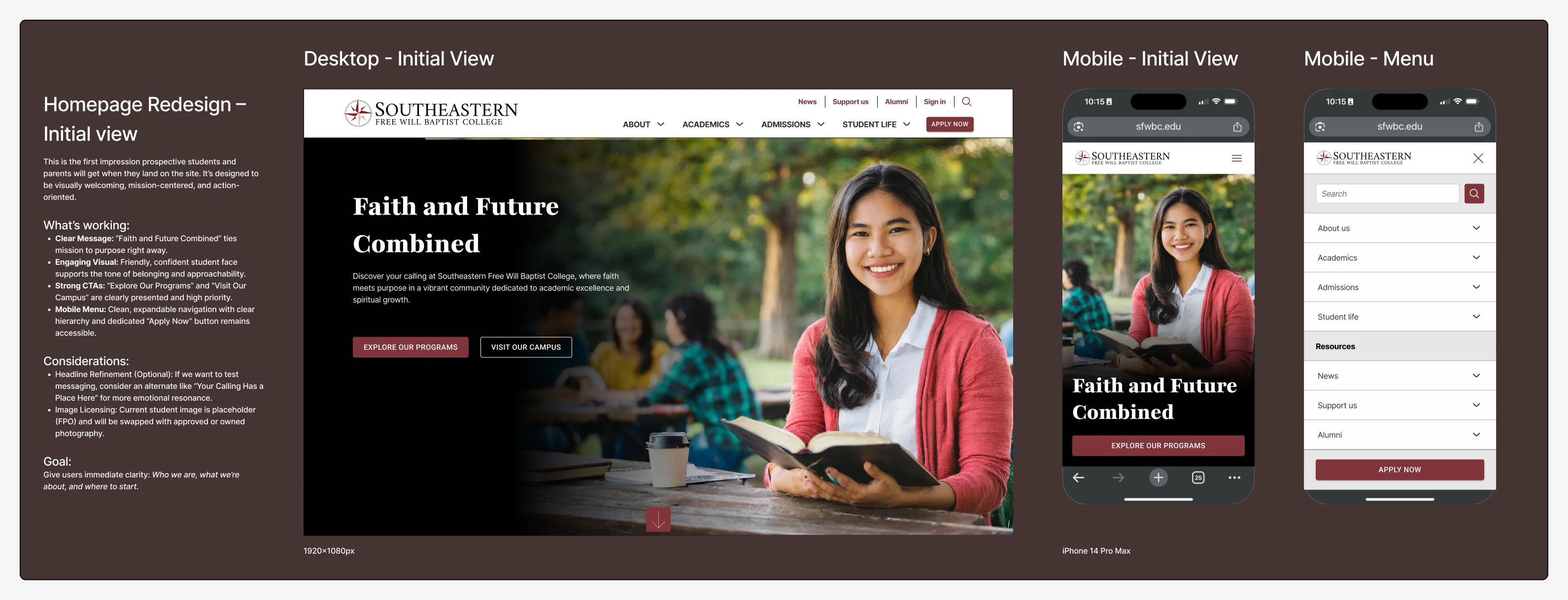
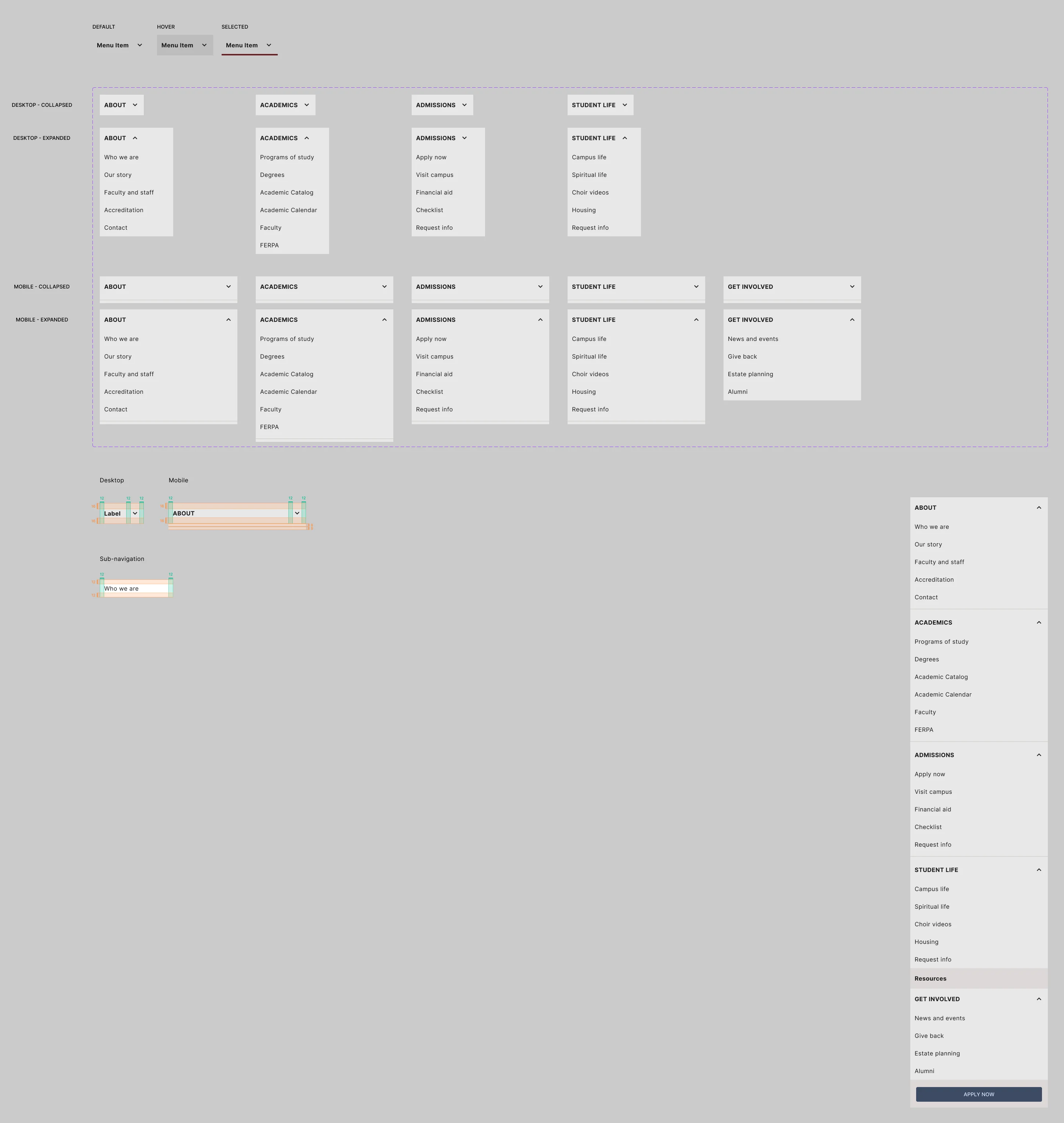
- Over half of visitors were on mobile, so I designed desktop, tablet, and mobile together, with Apply Now always reachable in the mobile menu.
- The baseline called for clear paths, so the homepage leads with Explore Our Programs and Visit Our Campus, with Apply Now in the header.
- The structure follows the audience priority: hero, degree programs, student and spiritual life, admissions and affordability in three cards, then testimonials (designed, then cut from scope on ).
 (opens full size in a new tab)
 (opens full size in a new tab)
 (opens full size in a new tab)
Accessibility specification
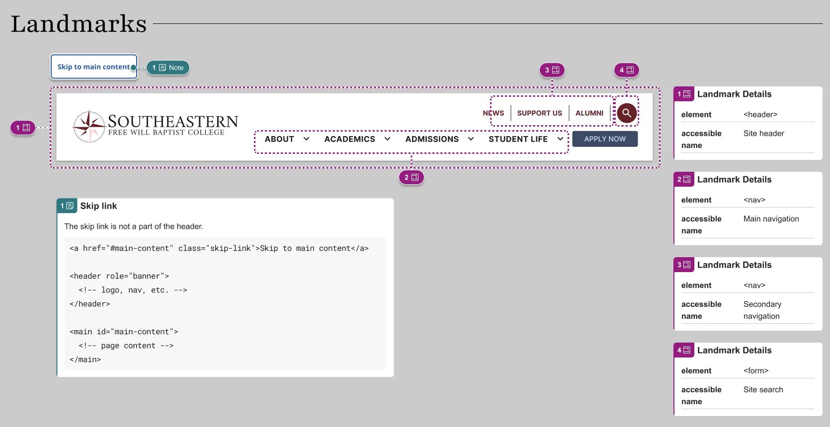
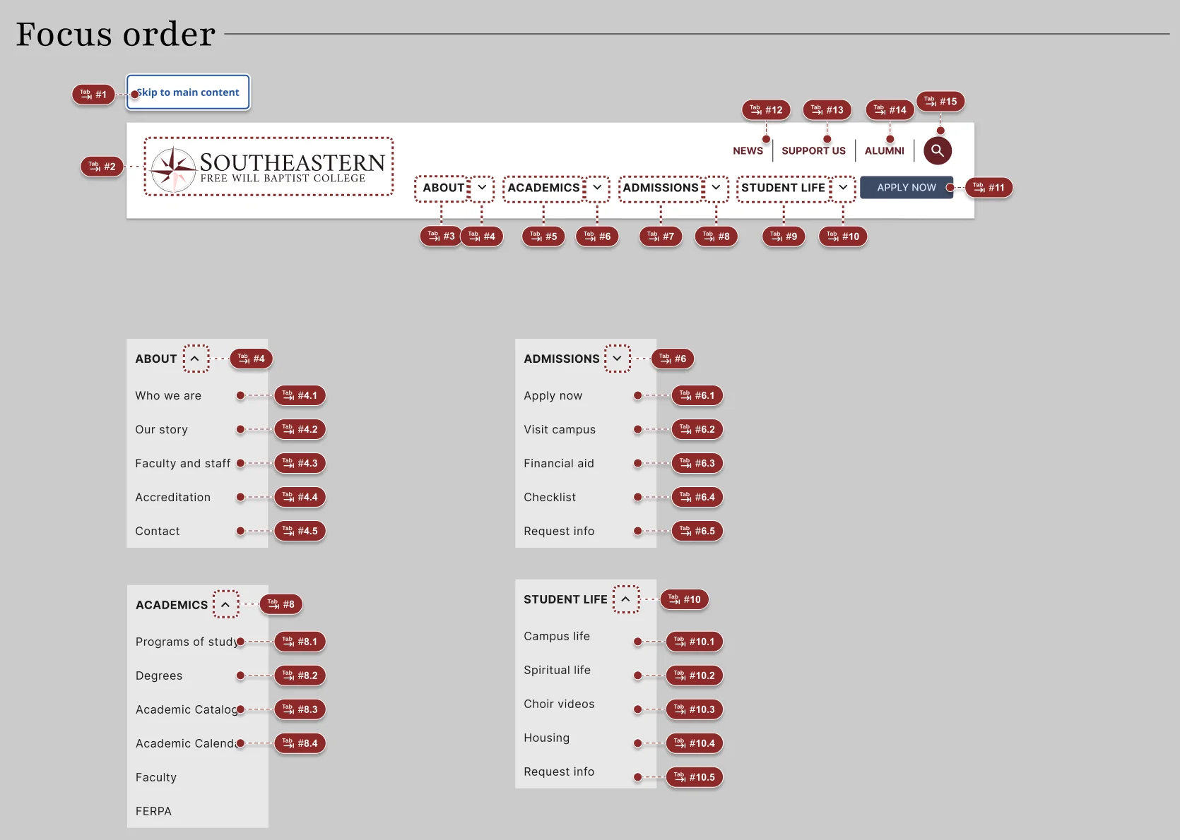
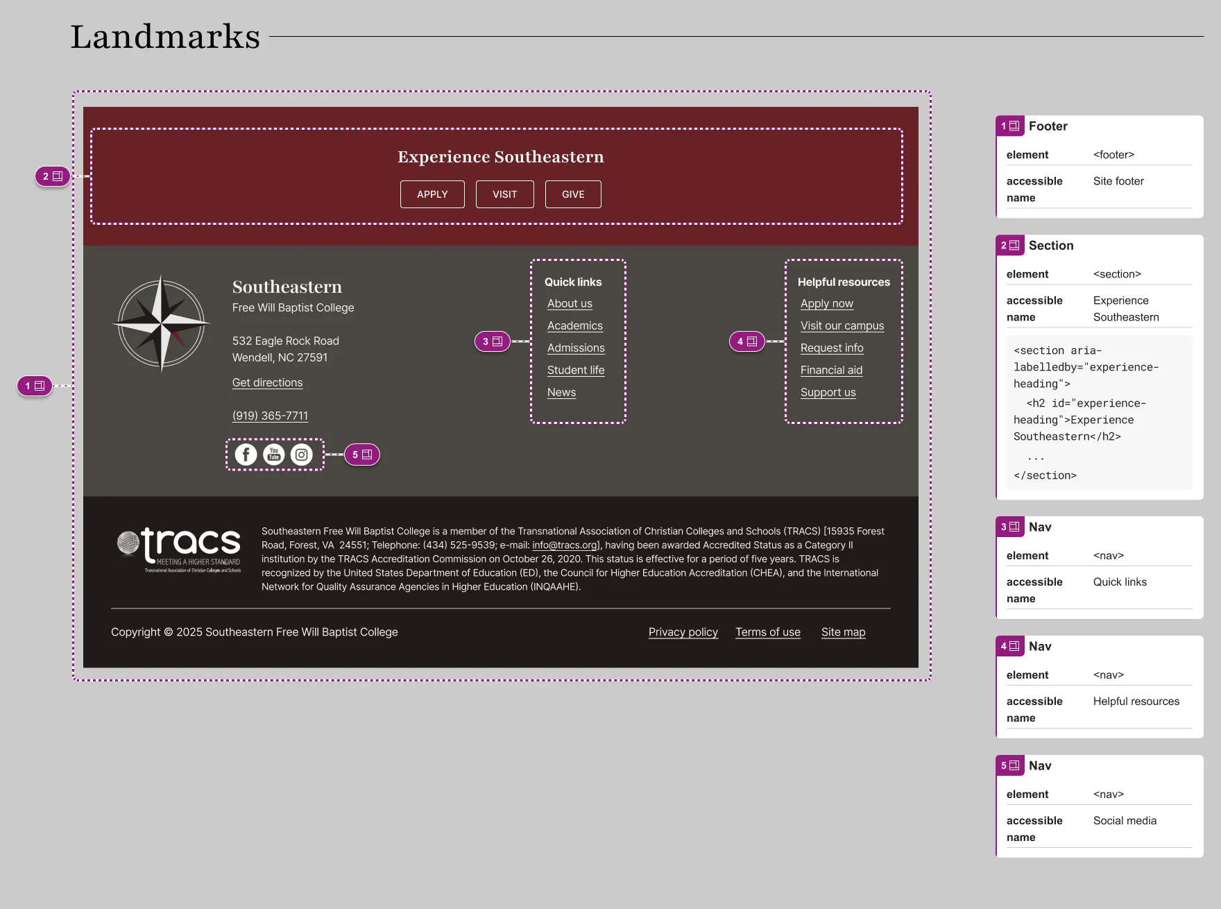
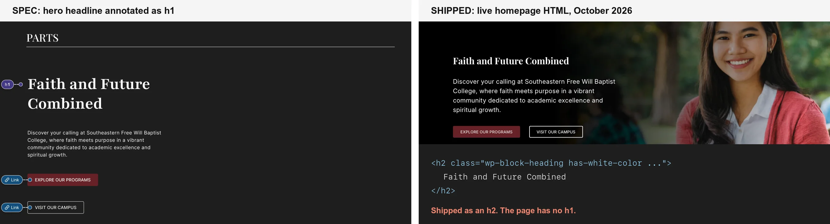
I annotated the header and footer across eight categories: landmarks, headings, reading order, focus order, buttons, links, inputs, and errors. Landmarks were mapped at desktop, tablet, and mobile. Focus order was sequenced through the expanded menus. Every link got a details callout. Page templates got heading annotations, starting with the hero headline marked as H1 (the level 1 heading).
 (opens full size in a new tab)
 (opens full size in a new tab)
 (opens full size in a new tab)
What shipped
The site went live between late May and early , based on Wayback Machine snapshots. No launch date was communicated to me; I found out it was live by noticing it. Most of the design made it through: the hero, palette, typography, program cards, and admissions cards. Two designed sections didn’t ship: the testimonials (below) and the campus life photo grid. The photo grid was removed during the build; I wasn’t part of that decision.
What we cut to hold the timeline
In mid-, college leadership set an expectation that the site would be live by August, about six weeks out. The testimonials section was designed, but the content wasn’t real yet: real quotes had to be sourced with a college staff member, and neither of us was available until July.
On , I made the call to remove testimonials from the launch scope and handle them as a follow-up, rather than hold the launch for content that didn’t exist yet. Everything prospective students needed first (programs, admissions, cost, and dates) stayed in. The section is fully designed at desktop and mobile, so adding it later is content work, not design work.
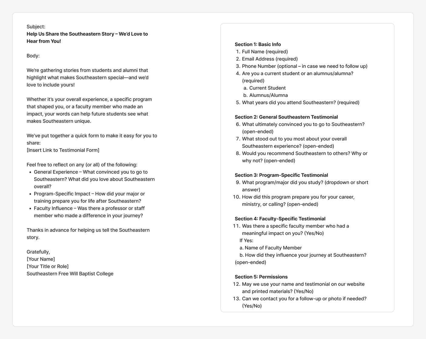
I followed up in July with the outreach ready to go: a request email and a structured form for collecting student and alumni testimonials, with usage permissions built in, plus a matching request for faculty bios. They were never sent, and the item stayed open. As of , the live site has no testimonials.
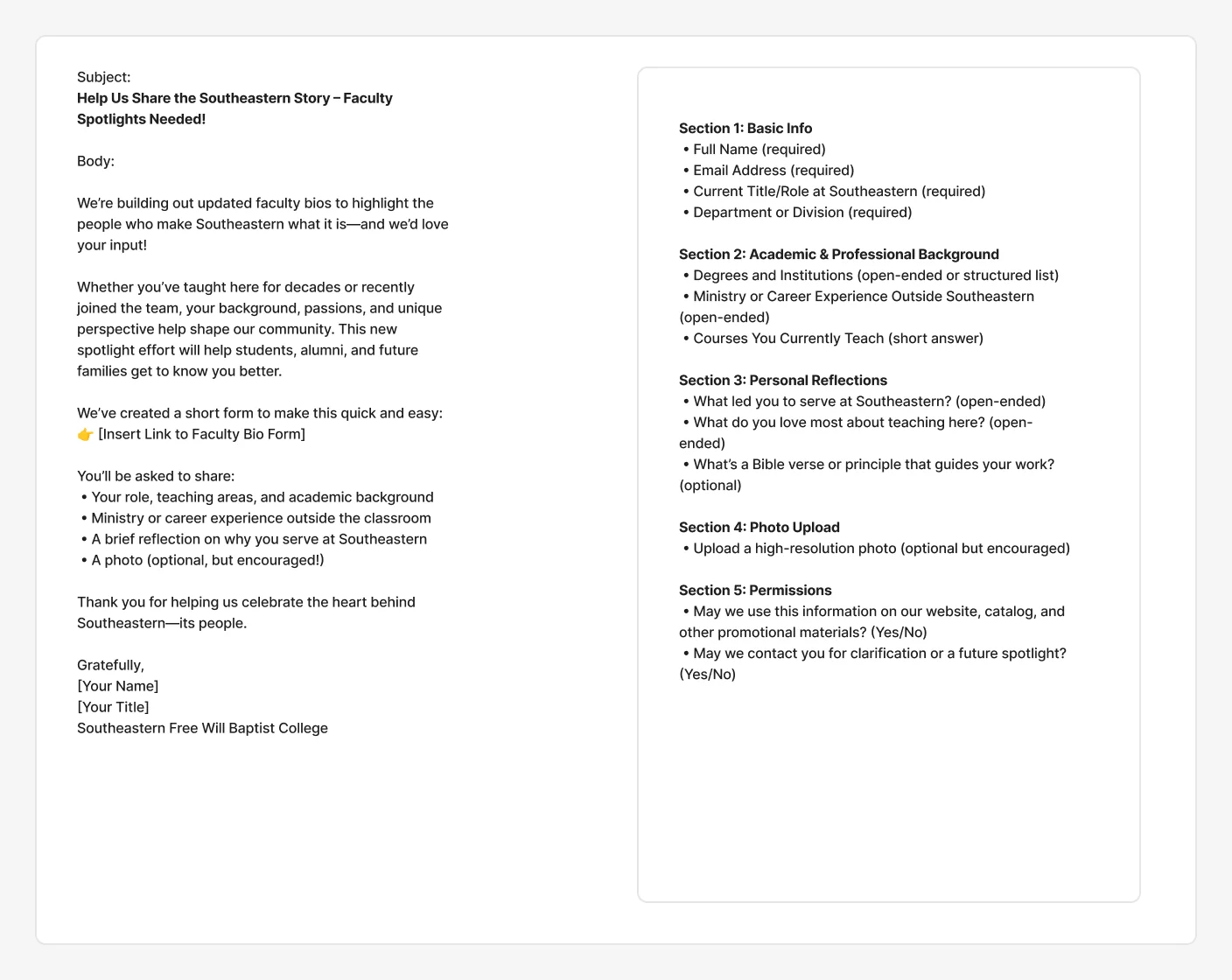
The August target didn’t hold. The site launched about ten months later; the delay happened after handoff, outside my scope. The cut was still the right call with what we knew in June: it kept a content gap from becoming a launch blocker.
 (opens full size in a new tab)
The gap
The developer read my spec. You can tell from the markup. My header annotation called for a secondary navigation landmark labeled “Secondary navigation.” The live site has exactly that, word for word. The <search> landmark I specified is there too.
Three lines down, the primary navigation’s label is gone. The attribute shipped as arial-lable, a typo that browsers ignore, so screen reader users get an unnamed navigation region. The hero headline I marked as the page’s H1 shipped as an H2 (a level 2 heading). The page has no H1 at all.
The spec was read, partly built, and never verified.
Accessibility
I compared my specification against the shipped HTML.
| I specified | It shipped as | Result |
|---|---|---|
<header> landmark | <header aria-label="Site header"> | Built |
<nav aria-label="Secondary navigation"> | Same label, verbatim | Built |
| Search landmark named “Site search” | <search aria-label="Site search"> | Built |
<nav> named “Main navigation” | arial-lable="Main navigation" (typo, no label) | Broken |
| Hero headline as H1 | H2; the page has no H1 | Lost |
| Focus order sequence | Hardcoded tabindex values 1 through 4, two elements both set to 2 | Broken |
| Three labeled footer navs | Two navs, neither labeled | Lost |
| Named links per link details | Search icon link has no accessible name; social icons are named only by tooltip title text | Lost |
Skip link to <main id="main-content">, with the markup written out | No <main> element; the skip link points to a target that doesn’t exist | Lost |
| Hero image marked FPO, to be replaced | Placeholder shipped to production | Lost |
The pattern matters more than any single row. Everything copied directly from the spec, like a label string or an element name, made it. Everything that required interpretation or checking did not. My best read of the focus order problem is that the numbered sequence in my annotation was turned literally into tabindex values, which breaks the natural order instead of preserving it. That’s an inference from the markup, not something I confirmed with the developer.
 (opens full size in a new tab)
An automated scan of the live homepage (axe-core 4.10.2, , desktop) found 3 Web Content Accessibility Guidelines (WCAG) level A and AA rule violations across 16 elements: the unnamed search link, menu items whose list semantics are broken by an app-style menubar role, and a hidden mobile menu that keyboard users can still tab into. It also flagged 6 best-practice failures, including the positive tabindex, missing H1, missing <main>, and broken skip link. At mobile width, the menu button has no accessible name. Automated tools catch only part of what a manual audit finds.
Measurement
The same thing happened to the analytics plan. The bot filtering and the event tracking on forms were never set up after launch. When I compared the same summer window before and after launch, a surge of low-engagement desktop traffic consistent with bots swamped the engagement numbers, and conversions were still recorded as zero in both periods. The segments most likely to be real visitors stayed roughly flat.
So I can’t tell you whether the redesign moved engagement, up or down. The baseline existed. The instrumentation to measure against it didn’t.
What I’d do differently
The design, documentation, and baseline were thorough. What was missing was an owner for the outcome after handoff. Nobody’s job included checking the build against the spec, or confirming that tracking worked, before launch. On this project that included me. My scope ended at the design file, and I wasn’t part of the launch at all; I learned the site was live after the fact. The testimonials are the clearest example: the content plan and outreach were ready, but nobody owned sending them, so the item stayed open. An open item without an owner doesn’t close.
On my next project I scoped the role differently: designer and product owner, unless the client has a dedicated point person who owns the project day to day. Someone has to drive it, and if that isn’t the client, it’s written into my scope. That puts acceptance in my hands. Accessibility criteria and analytics events get written into the stories the developer builds against, and the build doesn’t ship until it passes a check: landmarks, headings, focus order, accessible names, and working event tracking. Each failure above takes minutes to catch at acceptance and much longer to find after launch.