Design Best Practices Library
Fifty-nine interaction design practices, scoped from an ask for ten and released in order of complexity, each ending in a decision designers can work through.
At a glance
- Problem
- Designers kept re-researching decisions the team had already settled, such as whether a control should be a button or a link, and the answers didn't always match.
- What I decided
- I scoped an ask for ten practices into an agreed library of about sixty, released in twelve releases from basic to complex, each practice ending in a decision designers can work through.
- Result
- Published guidance used in design work. A lead designer fixed fields users kept clicking by making them read-only, following the Disabled vs. Read-Only Fields practice. That is an example of use, not a measure of adoption.
| Context | A design best practices library for the product design team at an enterprise insurer |
|---|---|
| My role | Project lead and author. I scoped the library, ran every practice through a seven-step research and review pipeline using AI tools for drafting, research, and auditor passes, and made every scoping, threshold, and ruling call. Peer review came from a senior designer. |
| Scope | Asked for about 10 practices. Delivered 59, across twelve releases. |
| Status | All twelve releases are out. A living library, with a backlog of five edits and new practices. |
| Timeline | Twelve releases, May to |
Links go places
In an audit, I found our skip to main content control built as a button.
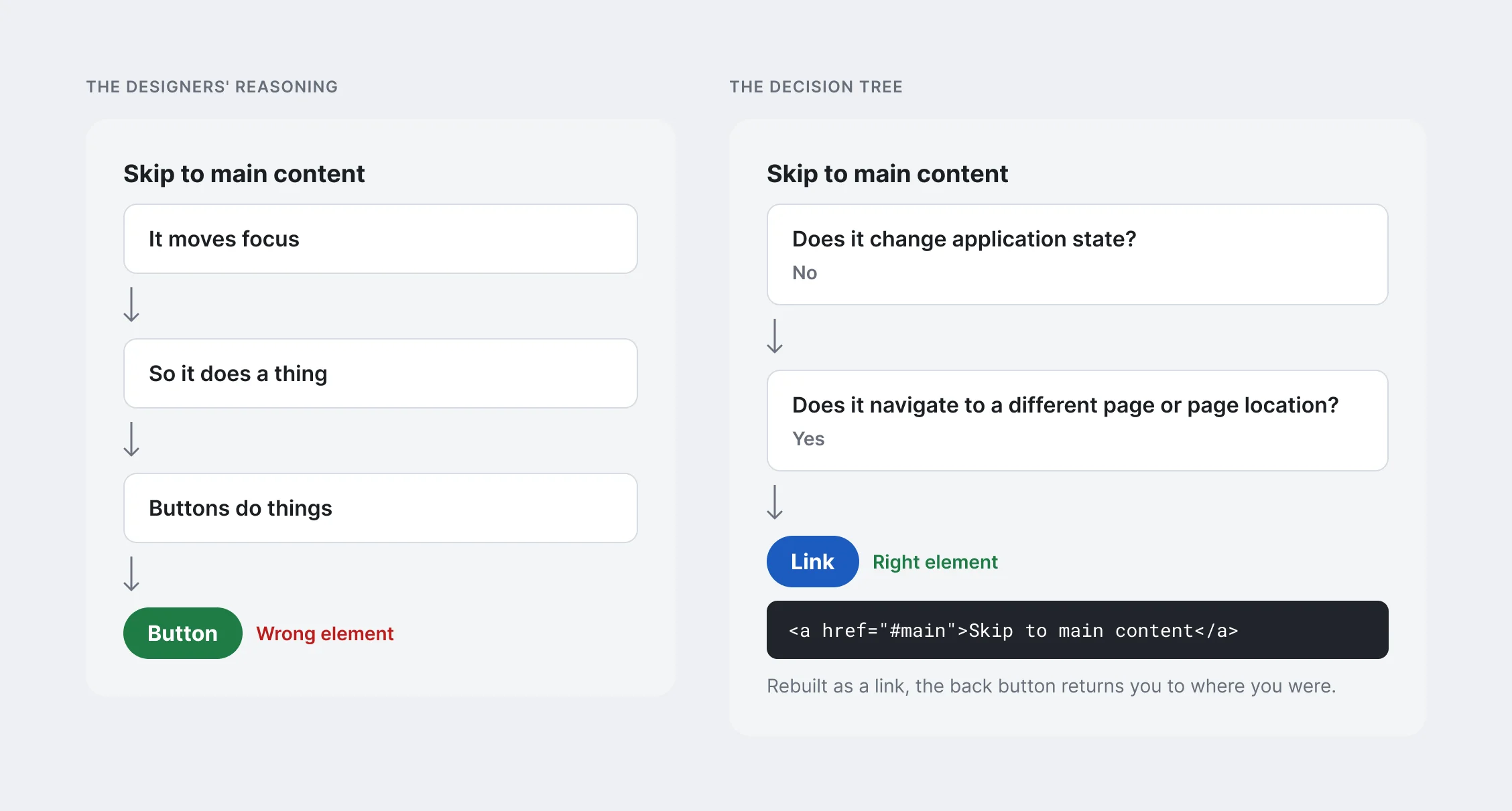
When I raised it, the designers had a reason. A skip link moves focus. It does something. Buttons do things. So, a button.
It’s a good argument, and it’s wrong. A skip link takes the user to another place on the page. Rebuilt as a standard in-page link, it changes the address, and the back button returns you to where you were. It goes somewhere. Links go places. Buttons do things.
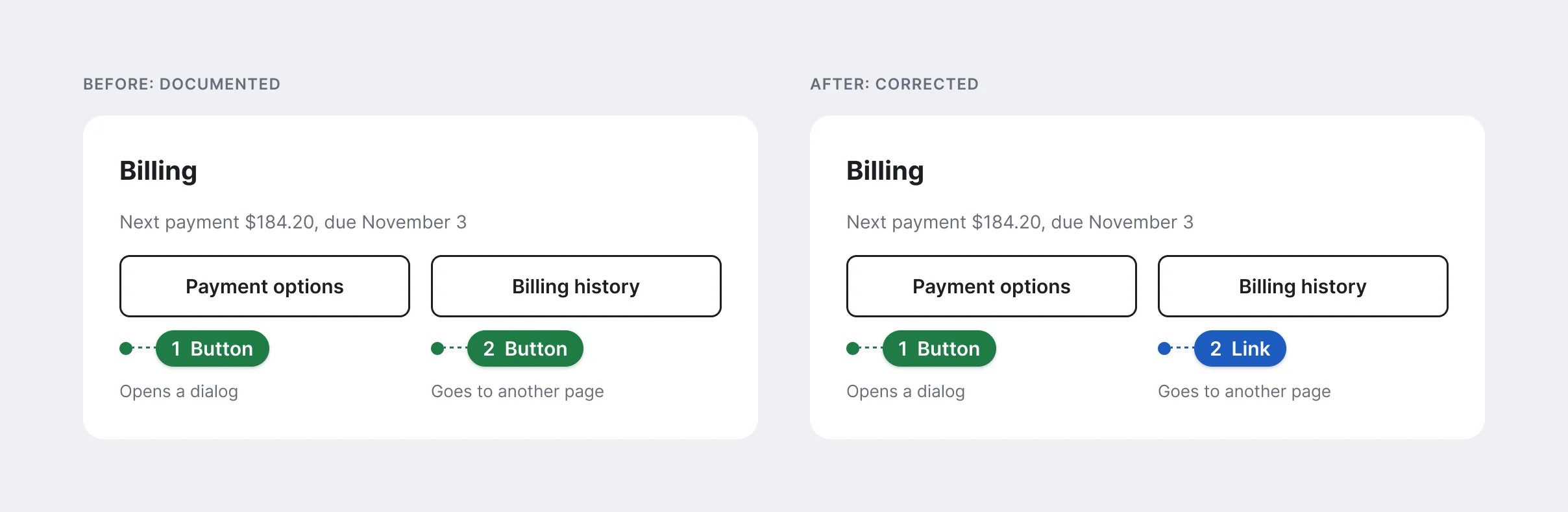
It wasn’t the first time. On a servicing page, two identical controls sat side by side, both documented as buttons. One opened a modal. The other took the user to a different page. To a screen reader user, both would announce “button,” and one would carry them somewhere they hadn’t asked to go.
 (opens full size in a new tab)
 (opens full size in a new tab)
Why one rule got its own practice
The wrong element breaks things for the people least able to work around it.
A screen reader announces “button” or “link” before the user acts. That announcement is the whole signal. Send the wrong one and the user acts on it, and some actions can’t be undone.
Keyboard users rely on the difference too. Buttons activate with Space or Enter. Links activate with Enter only. A button that navigates also loses what browsers give links for free: open in a new tab, bookmark, the back button.
The rule fits in five words. Designers still got it wrong, often for reasons that sounded right. That gap is why it needed a practice and not a poster.
The ask
For years, designers rebuilt answers the team had already settled. Each one did their own research to justify a decision someone else had made the month before, and the answers didn’t always match.
After several conversations made the gaps clear, I was asked to write about ten best practices to set the standard for design. Buttons vs. links was the first one on that list.
Fifty-nine practices, twelve releases
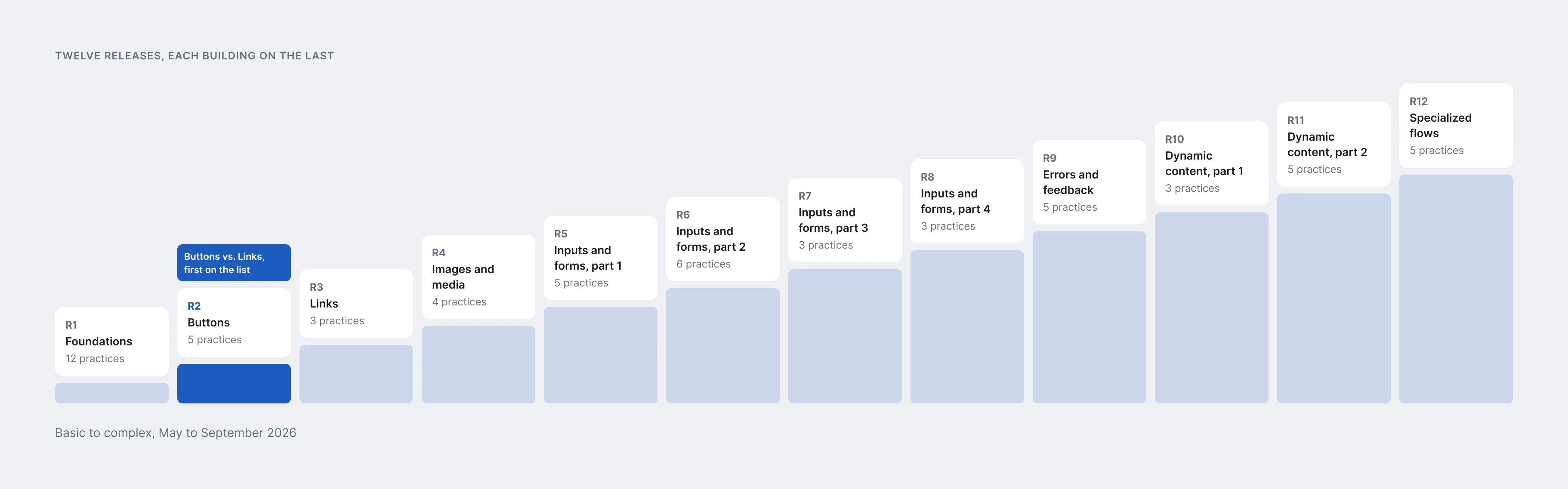
The agreed scope was about sixty practices, published in twelve releases from May to . The ask had been for ten.
Nobody knew the depth of the ask at the start, me included. Research on the first ten kept turning up the practices they depended on. A practice on choosing the right input is no use without one on autocomplete. A practice on quote and checkout flows has to stand on practices for forms, errors, progress, and confirmations.
I scoped the full library from there, and the scope was agreed along with a release cadence.
The releases climbed in complexity. Foundations went first: principles, content and voice, color and contrast, headings, reading order, focus order. Then buttons, links, and images. Then four releases on inputs and forms, one on errors, two on dynamic content, and specialized flows last. Each release built on the ones before it, so designers could grow with the library instead of starting at the hardest material.
 (opens full size in a new tab)
Making it required
Our organization leads through influence far more often than mandate. I pushed for this library to be the exception. Without shared guidance, design system production was held back and the experience we delivered wasn’t consistent from team to team. Guidance designers could skip wouldn’t fix that.
Digital experience leadership agreed. In the library launched as required practice for the whole user experience (UX) team, announced at the director level. It’s the only practice our UX organization has made mandatory in the past year.
Required didn’t make it welcome. Designers saw the practices as a compliance gate, so the rollout was built to take pushback. Each practice got its own discussion thread, so questions stayed attached to the right topic and left a record. Anyone could tag me to challenge a rule or bring a case from their own work. Every practice has a quick reference to build to and a deep dive that explains why, so a designer who disagrees can read the reasoning first. When a rule changes, the change is announced.
Enforcement isn’t mine. Design review is where non-compliance shows up, and managers judge how well their teams meet the practices. That’s why I can point to examples of use, not a measure of adoption.
Here’s who owns each part.
| Responsibility | Owner |
|---|---|
| Write and maintain the practices | Me |
| Review and challenge them | A senior designer, plus any designer through each practice’s discussion thread |
| Rule on conflicts and challenges | Me. Leadership doesn’t sign off on rulings. |
| Make them required | Digital experience leadership, |
| Apply them in project work | Product designers |
| Check compliance | Managers, through design review (informal) |
| Measure adoption | No one yet |
How a practice gets made
Every practice went through the same seven steps: definition, research, synthesis, rationale, pressure test, the practice itself, and a final designer-facing version. The pressure test ran twice, once internally and once as an external auditor pass, and each round’s findings were applied or declined on the record. I used AI tools for drafting, research, and the auditor passes. The scoping, the thresholds, and every ruling were mine.
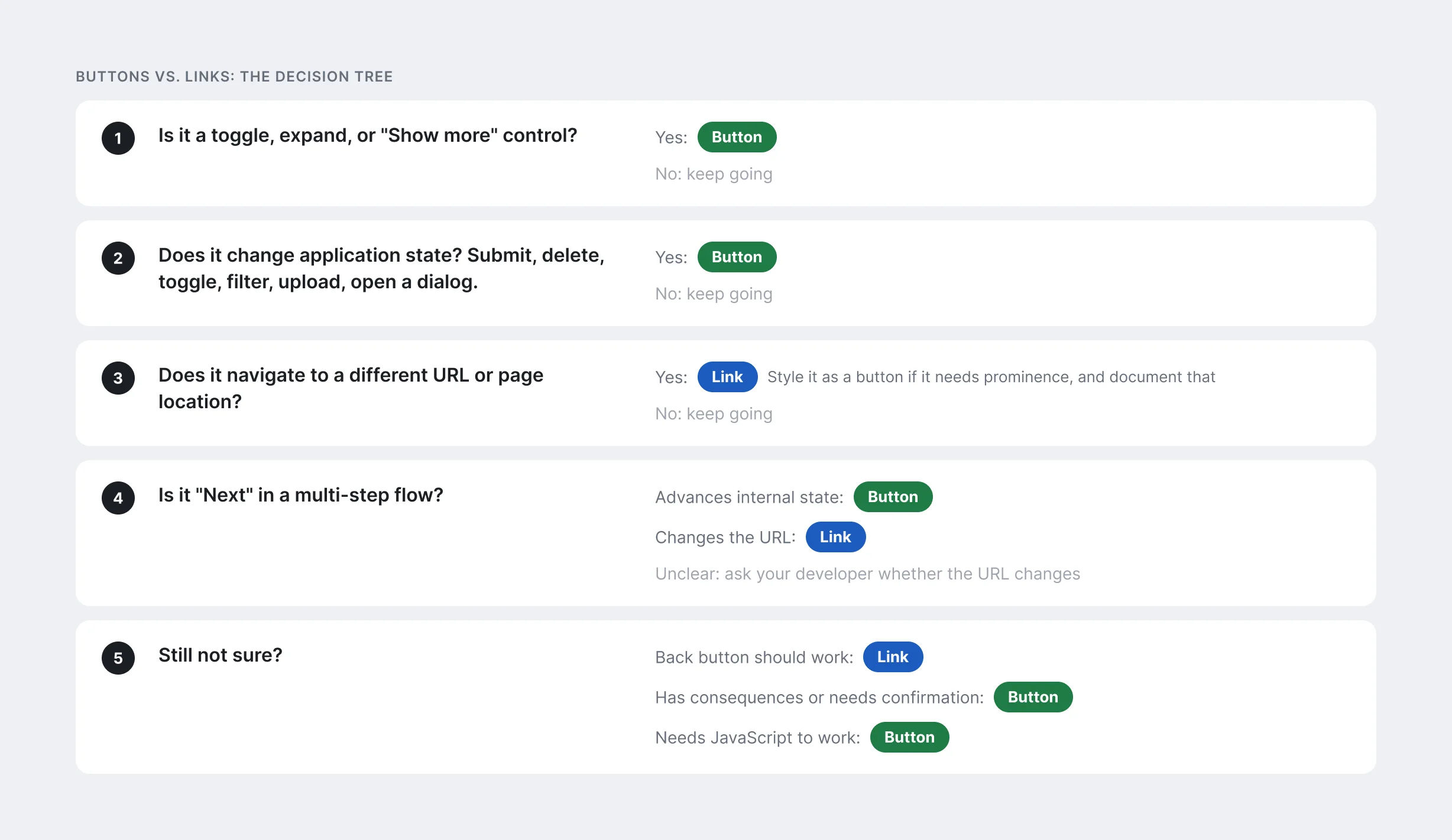
The practice designers actually use is short. It opens with the rule and a rule of thumb, then lists when to use it, when to avoid it, what to do, what not to do, and the common anti-patterns. It ends with a decision tree.
The decision tree is the part that answers the skip link argument. It doesn’t ask whether the control does something, because almost every control does something. It asks whether the interaction changes application state or takes the user to a different place. When that’s still unclear, it gives tiebreakers. If the back button should work, it’s a link. If it has consequences or needs confirmation, it’s a button.
 (opens full size in a new tab)
Peer review
A senior designer reviewed the practices as they were published and left detailed comments, round after round. Those reviews found things the pipeline didn’t.
Some were contradictions between pages. One practice told designers that filters always use checkboxes, while another made an exception for single-select filters. Some were overstatements. One practice presented role="switch" as a Web Content Accessibility Guidelines (WCAG) requirement, when it’s our design system’s convention. I ruled on each one. The switch guidance now says plainly that it’s a design system standard, because a practice that overstates its authority teaches designers to distrust the rest of the library.
When a ruling touched more than one practice, I made the edits together, as one paired change across every affected page, so the library never disagreed with itself between releases.
What changed
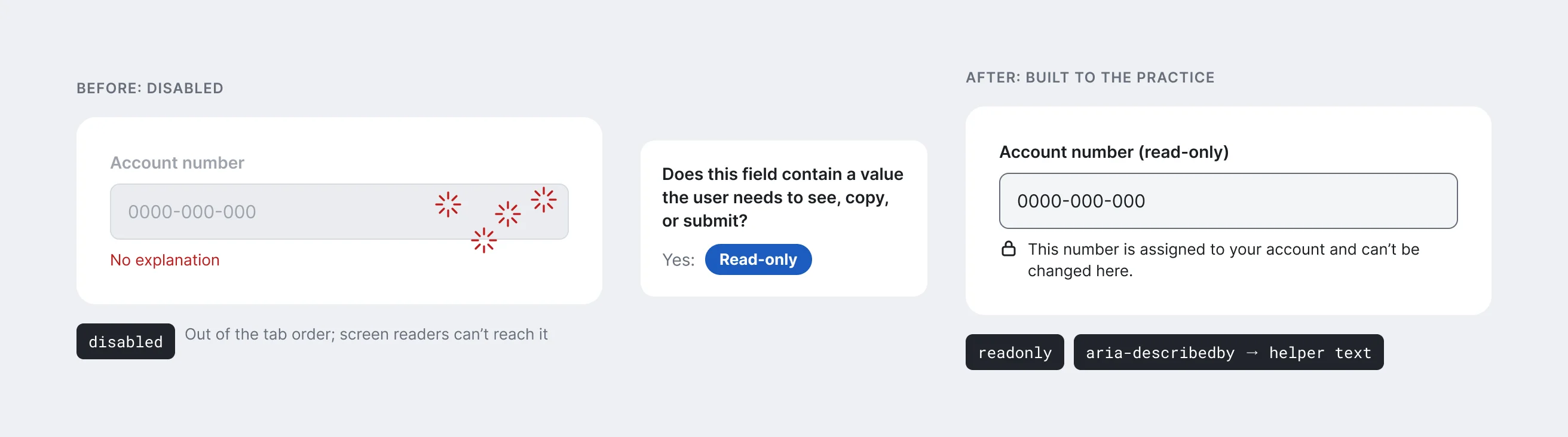
All twelve releases are out, and the practices are in use. The most recent example came from a lead designer working on rage clicks: users repeatedly clicking fields that were disabled and gave no explanation. She needed to fix it in a way that improved accessibility too, because disabled controls drop out of the keyboard order and are hard for screen reader users to reach at all.
The Disabled vs. Read-Only Fields practice already had the answer. Its first question is whether the field contains a value the user needs to see, copy, or submit. Hers did. So the answer was read-only: the value stayed in the keyboard order and readable by screen readers, at full contrast, with an icon and descriptive text tied to the field with aria-describedby so everyone could tell why it couldn’t be changed. She built the fix to the practice.
It wasn’t the only time. Designers have used the practices across multiple topics. These are examples of use I’ve seen, not a measure of adoption.
 (opens full size in a new tab)
A living library
The library isn’t finished, and it isn’t meant to be. There’s a backlog of five edits and new practices. Some come from peer review, some from designers running into a case the library doesn’t cover yet. A standard that stops changing stops being used.
What I’d do differently
I’d push for the practices to be a formal step in design review from the first release. Review catches misses now, but informally, and enforcement is left to each manager. A formal step would make applying a practice part of what “done” means, not a choice each designer makes on a deadline.
Related writing