Accessibility Documentation System
An annotation kit, a documentation template, and an audit template that give accessibility decisions a place in the design file.
At a glance
- Problem
- The design system had no accessibility documentation, so focus order, alt text, and ARIA (Accessible Rich Internet Applications) were decided by default, by whoever touched the code last.
- What I decided
- I dropped my custom annotation system for a proven public kit, rebuilt it with the pieces it lacked (errors, dynamic content, ARIA targets), and paired it with documentation and audit templates in the same ten categories.
- Result
- A system built and taught: released, piloted, and backed by 15 training sessions. Consistent use is limited, about 3 in 10 designers by my own count in design reviews.
| Context | Enterprise design system at an enterprise insurer |
|---|---|
| My role | Designed and built the accessibility annotation system, its documentation and audit templates, and the designer training |
| Built on | CVS Health Web Accessibility Annotation Kit, v2.8.0, licensed CC BY 4.0 |
| Used by | Product designers, who annotate, and engineers, who build from the annotations |
| Tool | Figma |
| Timeline | Custom system started in the first quarter of . Switched to the CVS base early in the second quarter of , after axe-con . Released for use and piloted in the first quarter of . Training built after release and delivered in the second and third quarters of . |
Style doesn’t decide semantics
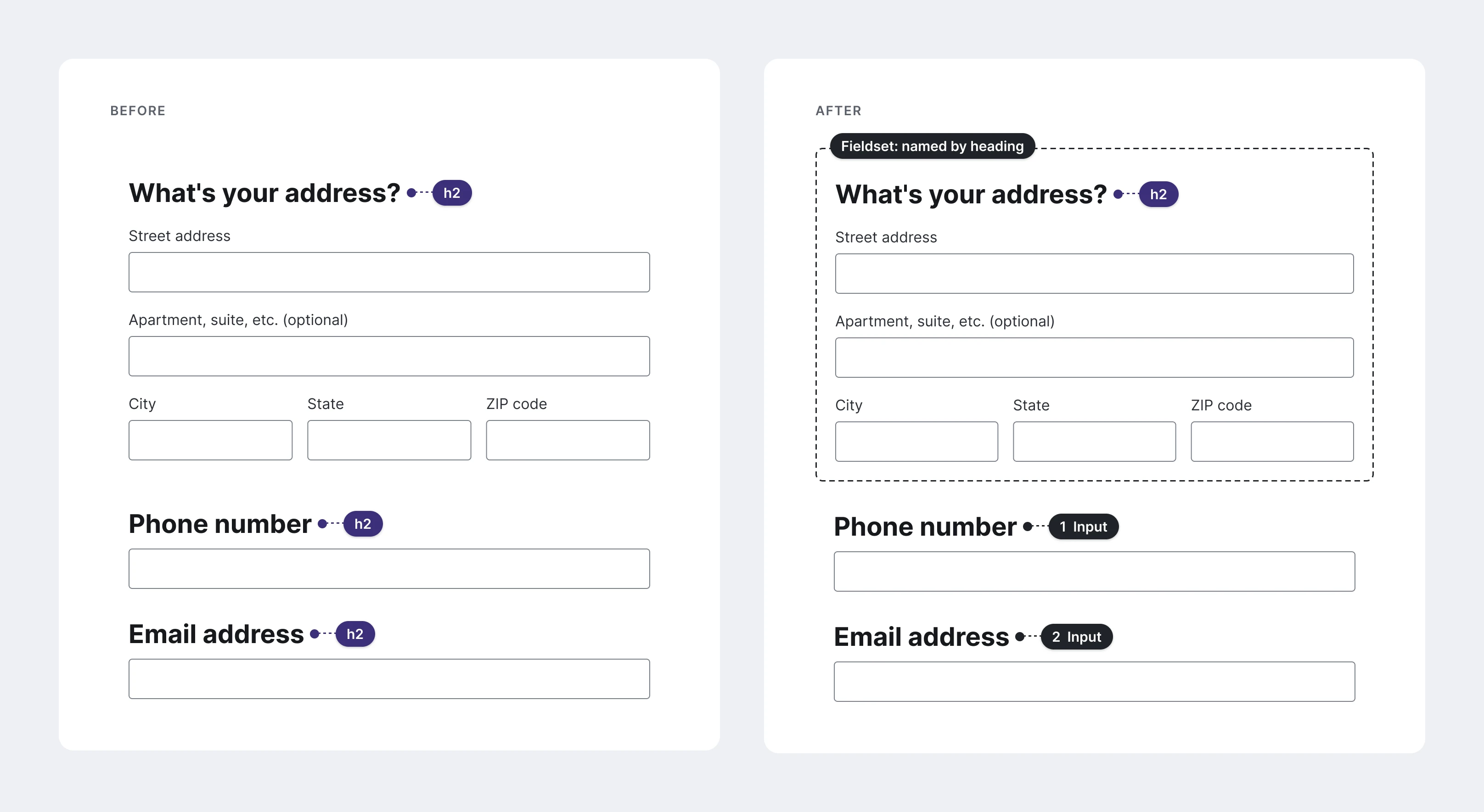
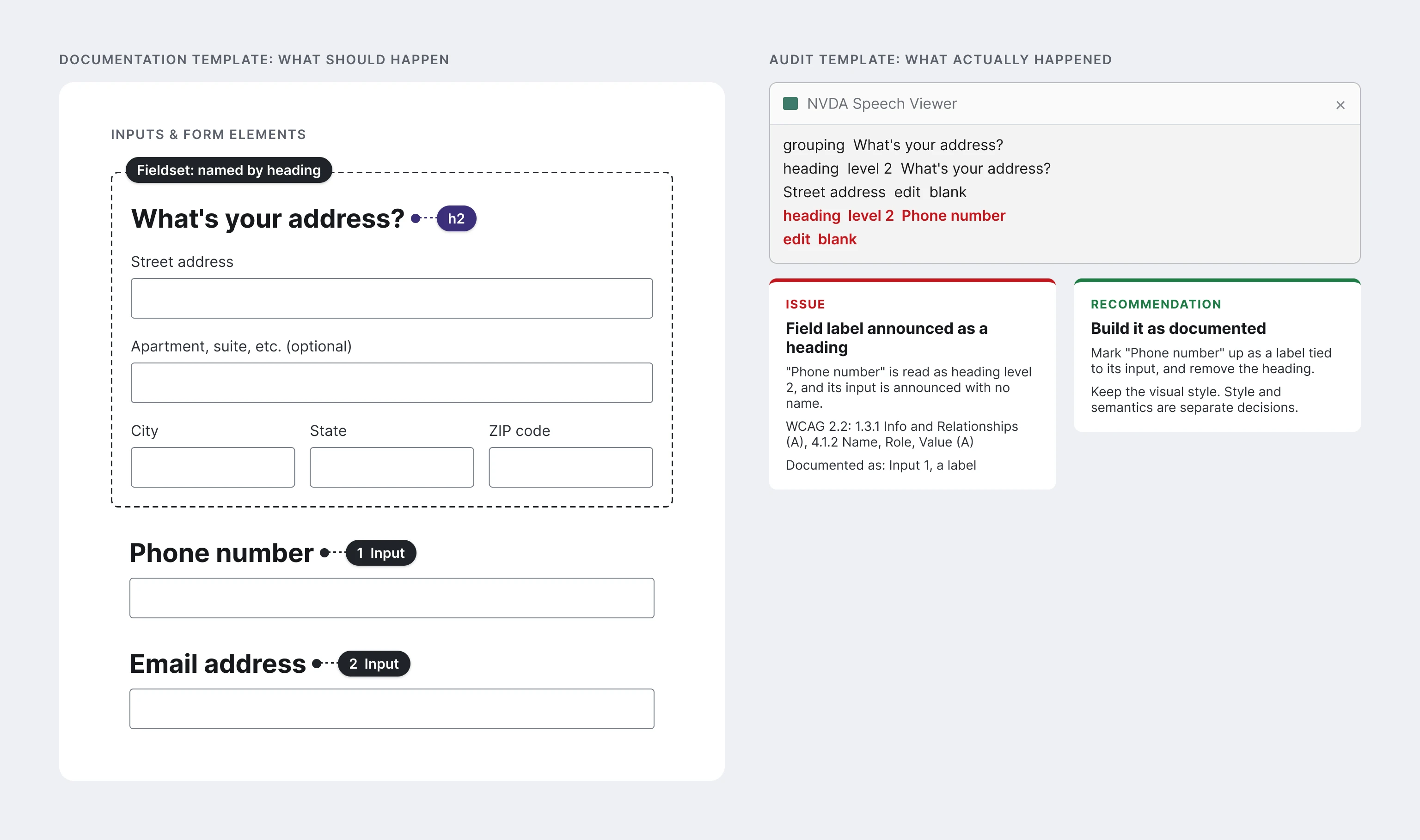
A designer asked me to review a form. Above an address block (street, apartment, city, state, ZIP) sat the question “What’s your address?” set in a large, bold style. It was the section’s heading and needed to be an H2 (a level 2 heading), but she hadn’t marked it yet.
Below the block were several standalone fields. Their labels used the same type style as the heading, so she pinned each one as an H2.
The mistake is easy to make, and screen reader users are the ones who pay for it. Every one of those labels would announce as a section heading, and anyone navigating the page by headings would land on a list of field labels. Using the annotation kit and its documentation, I walked her through the difference. The address question is a heading because it introduces a section. The field labels only look like headings. Style doesn’t decide semantics.
She corrected her pins, grouped the address fields as a fieldset named by its heading, and engineering got the right guidance before build.
The rule runs the other way too. On another flow, a designer marked a line set in plain body text as an H2, because it introduced the section beneath it. That was the right call, and I backed it with the documentation. A later design brought the visual style in line with the structure.
Before this system, neither conversation could have happened in design at all. There was nowhere in the design file to have them.
 (opens full size in a new tab)
The problem
When I started, the design system had no accessibility documentation. The docs hadn’t failed anyone. They didn’t exist.
Designers knew about contrast and could measure it, but there was no consistent way to record the result in a design file. So accessibility conversations started after the work was already in engineering’s hands.
Everything else was assumed or guessed. Nobody reviewed focus order; the team trusted that developers would get it right. Alt text worked the same way. ARIA was engineering’s best guess, built from web searches and intuition.
Each of those is a design decision. Without a place to record it, the decision got made by default, by whoever touched the code last.
Designers had asked for this. In a workshop, they ranked a standard annotation process, a checklist, and a review cycle as top needs.
Choosing a base
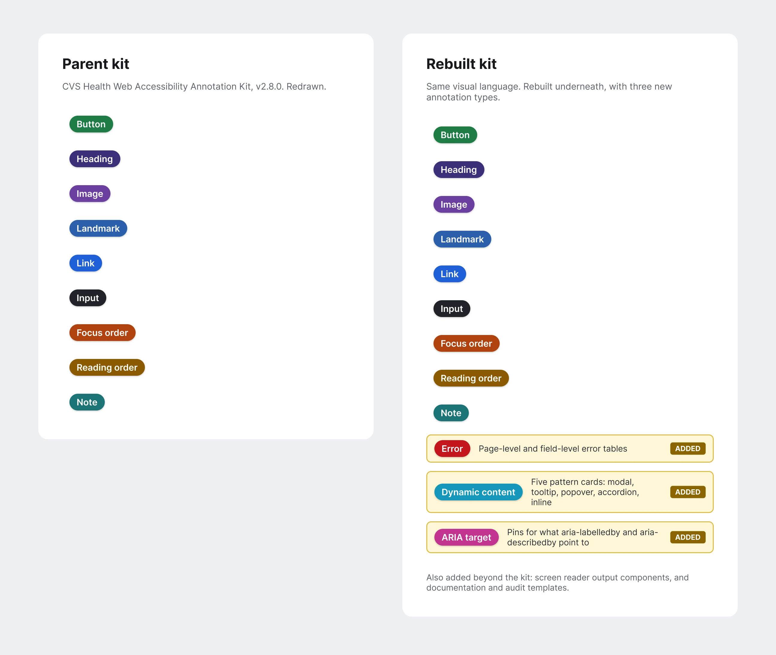
I started by building a custom annotation system. Partway in, I attended a session at axe-con where Adobe described adopting the Web Accessibility Annotation Kit from the CVS Health Inclusive Design team. The kit was public, and another large design organization was already using it. A base that was proven elsewhere beat one I’d have to prove myself, so I dropped my custom work and rebuilt on top of the kit.
The base was version 2.8.0, still the current public version. Credit for the original structure and visual language belongs to that team. Most of what you see in the rest of this case is mine.
 (opens full size in a new tab)
What I built
The two systems look alike. Underneath, almost everything has changed.
Annotations for where accessibility breaks most
The parent kit had no way to document errors or dynamic content. Those are two places where products routinely fail screen reader users: error messages that never get announced, and content that changes without telling anyone. Leaving them out meant designers stayed silent on the hardest parts of the interface, and engineering kept guessing.
I built an Errors block and a Dynamic content block.
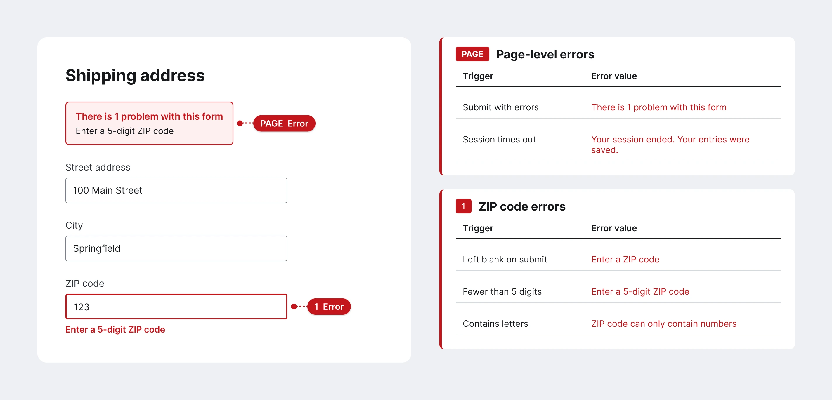
The Errors block works at two scopes. A page-level table covers errors that belong to the whole form, and a separate table for each input covers that field’s own errors. A numbered error stamp on the design points to the matching table. Every row pairs the trigger that causes the error with the exact error text the user sees. That turns “show an error” into a list engineering can build and quality assurance (QA) can test against, one row per case.
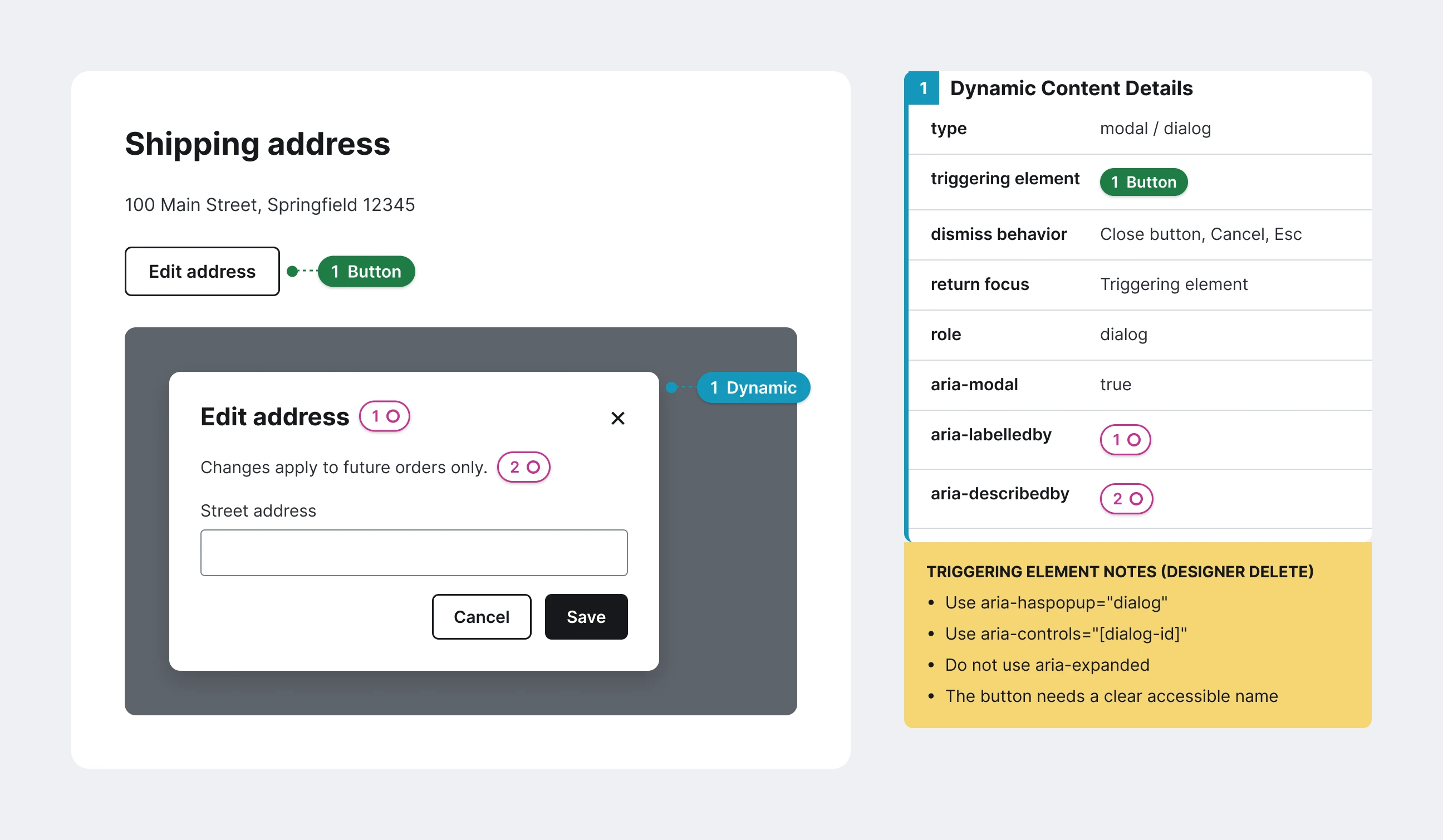
The Dynamic content block comes in five variants, one per pattern: modal or dialog, tooltip, popover, accordion, and inline section. Each variant asks only the questions that pattern needs. A modal records its dismiss behavior (close button, call to action, Escape, click outside), where focus returns when it closes, its role, and aria-modal. A tooltip records whether hover, focus, or click triggers it. An accordion records its default state. Every variant names its triggering element by stamp number, so the card points back to the exact button or input on the design.
Each card also carries a yellow note for the designer, deleted before handoff, that lists which attributes the trigger should use and which it shouldn’t. For a modal, the trigger takes aria-haspopup and aria-controls, but not aria-expanded. For an accordion, the trigger takes aria-expanded and aria-controls, but not aria-haspopup. Those are the distinctions engineers were guessing at before, and the note puts the answer next to the decision.
 (opens full size in a new tab)
 (opens full size in a new tab)
ARIA targets
The parent kit had no ARIA targets either. They’re small numbered pins, placed next to the elements an ARIA relationship points to. When a dialog card lists aria-labelledby 1 and aria-describedby 2, matching pins beside the dialog’s title and description show which text names the dialog and which describes it. That moved a decision engineering used to make from search results into the design file, where the designer can see it and a reviewer can check it. Screen 04 shows them in use.
Structure under the surface
Most of the rebuild doesn’t show in a screenshot. I rebuilt the blocks with auto layout and regrouped their layers so each block’s structure communicates what it is. I also debugged the file itself: broken components and variants, key-value pair issues in the detail cards, and broken links to MDN (Mozilla Developer Network) reference pages.
Every section of the kit also has a visual regression test frame: copies of each stamp and card filled with override text. When I change a core component, the frames show whether the change breaks instances teams have already placed in their files. The approach comes from the CVS team’s work. I built the frames for the rebuilt components, including the new ones.
A documentation template with one source of truth
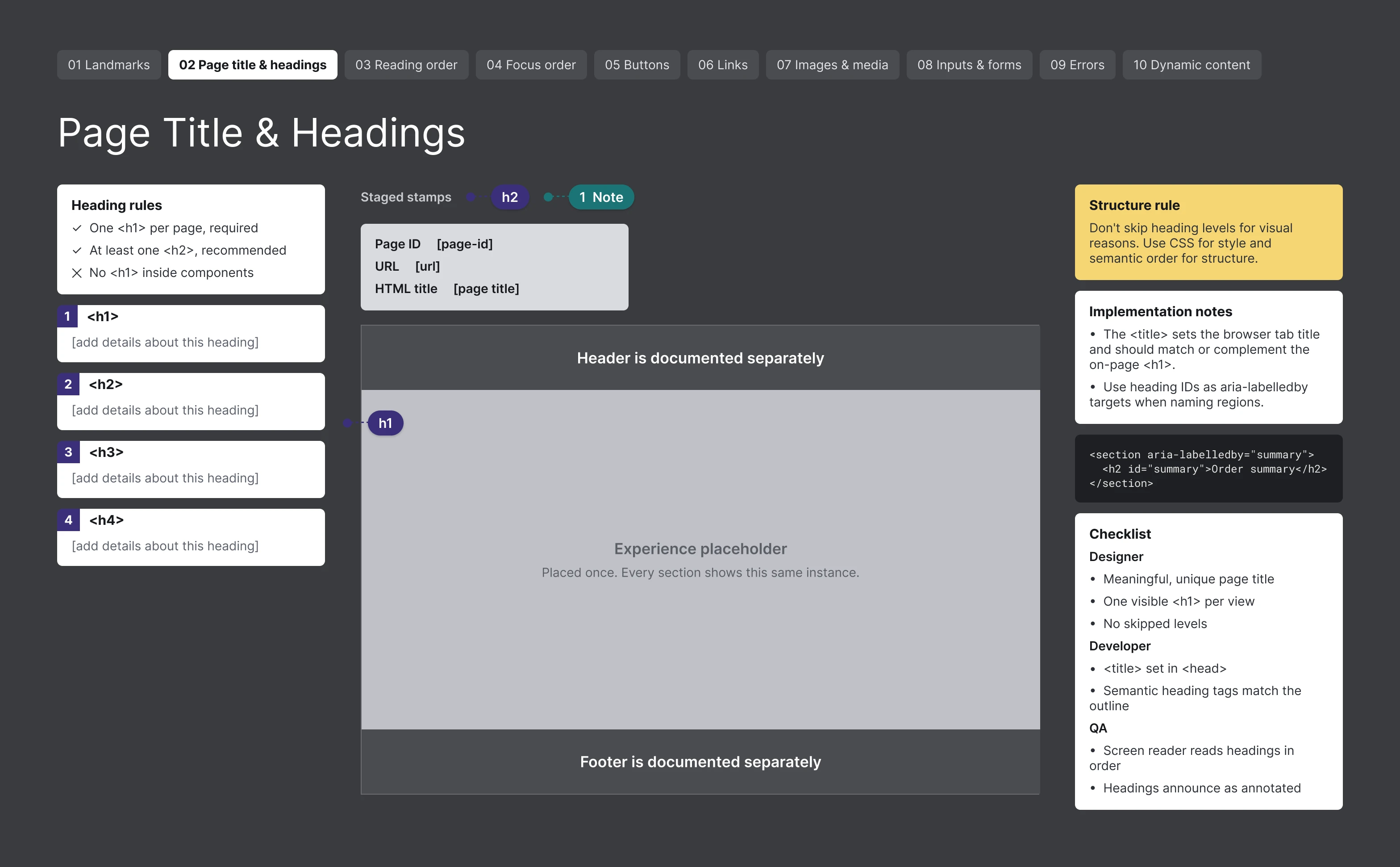
Annotation components alone don’t tell a designer where to start. The documentation template does. It’s a Figma page split into ten sections, one per category: landmarks, page title and headings, reading order, focus order, buttons, links, images and media, inputs and form elements, errors, and dynamic content.
The designer places the experience once, inside a single component, and every section shows an instance of it. Change the design and all ten views update. Headers, footers, and other global elements get covered by an “Audited Separately” marker, because they’re documented once for the whole product, not on every screen. The setup guide keeps documentation inside the main landmark unless there’s a reason to go beyond it.
Each section has the same layout. Ready-to-fill detail cards sit on the left, and stamps for that category are staged above the design, ready to drag. On the right are the rules for that category, implementation and ARIA notes with example markup, and a checklist split by role: what the designer confirms, what the developer builds, and what QA tests. The headings section’s structure rule is the opening story in one line: don’t skip heading levels for visual reasons; use CSS for style and semantic order for structure.
 (opens full size in a new tab)
An audit template in the same shape
The audit template mirrors the documentation template, section for section. Each category holds the screen under review, audit cards, a recommendation card, an issue card, and the screen reader output components. A team that documented its design in the first template can audit the build in the second, using the same ten categories, plus an accessibility tree section, so an audit finding lines up with the decision it tests.
Recording what the screen reader actually said
The annotations describe what should happen. Audits need a record of what actually happens. I built a set of screen reader output components for that: a VoiceOver caption window, the VoiceOver rotor, the NonVisual Desktop Access (NVDA) Speech Viewer, and the NVDA Elements List. During an audit, they document what the screen reader really read, in the same file and the same visual language as the annotations. A finding becomes the spec beside the evidence, instead of a sentence in a ticket.
 (opens full size in a new tab)
Teaching it
A system designers don’t understand doesn’t get used. The system was released and piloted with teams first. Once it was in use, I built the training and delivered 15 sessions that taught designers about accessibility and how to document it with the kit. The curriculum follows the system: setup sessions on preparing a file and using the templates, then one session for each of the ten categories, from landmarks through dynamic content. The series covered every section of the template.
The sessions are delivered activity. They show what I taught, not what changed because of it.
Office hours
When the series ended, I opened office hours in September so designers could bring their own work.
In October, a product designer brought a complex page she had annotated herself. Landmarks, headings, and reading order were already right. She needed help only where the kit gets hard: a radio group that needed a visible label, the order of the label, options, and helper text, and a message that should appear once instead of on every recalculation. Before the session ended, she was applying the same section landmarks to a second page without being asked.
It was the first layout like that since the accessibility program started in that I didn’t annotate myself. She credited the training.
She wasn’t the only one. Weeks after the series ended, another designer came back unprompted with a question about links styled as buttons.
The same October session also found problems in the standard. Her accordion question exposed two conflicts and three gaps in the design system’s own accordion spec. Office hours are where designers bring the hard cases, and they’re also where the standard learns what it got wrong.
The accordion was built the way the session settled it: a heading wrapping the button, with the caret icon inside the button, and aria-expanded and aria-controls confirmed on the trigger. Those are the same two attributes the Dynamic content card’s designer note calls for. The fix didn’t stop at her page. It went to engineering as an update to the shared accordion component, so every team that uses it gets the corrected pattern.
What changed
When designers use the system, the conversation about accessibility moves into design, where it costs the least to change. The address form is the clearest example: a semantic mistake caught in review, explained with the kit, and handed to engineering correct.
Adoption is the limit. By my count in design reviews, about 3 in 10 designers use the system consistently. The rest use it when it’s convenient, or not at all. Design teams are stretched thin, and when time is tight, optional work is the first thing dropped. That count is my own observation, not a measurement, and without consistent use there’s no clean way to measure what the system changes downstream.
Here’s what I can claim, sorted by how strong the evidence is.
| Evidence | What I can claim |
|---|---|
| Delivered | The system, released and piloted with teams, and 15 training sessions |
| Use | Mistakes caught in design review and handed to engineering correct, like the address form |
| Independent use | A designer annotated a complex page correctly on her own and brought only the hard cases to office hours. Her question found five problems in the standard’s accordion spec, the accordion was built to the corrected pattern, and the fix went to engineering as a shared component update |
| Adoption | About 3 in 10 designers use it consistently, by my own count in design reviews |
| Sustained impact | Not measured. Without consistent use, there’s no clean baseline for downstream defects |
What I’d do differently
The system works where it’s used. What it lacked was a place in the process. Annotation sat beside design work as an extra step, and an extra step loses to a deadline every time.
Next time I’d build the checkpoint and the kit together. Annotation would be part of what “done” means at design review from day one, and the review would check for it the same way it checks for layout and content. Then the system doesn’t depend on a stretched designer choosing to use it, and adoption becomes something you can measure.