Experiment 001: Labels vs. Div Soup
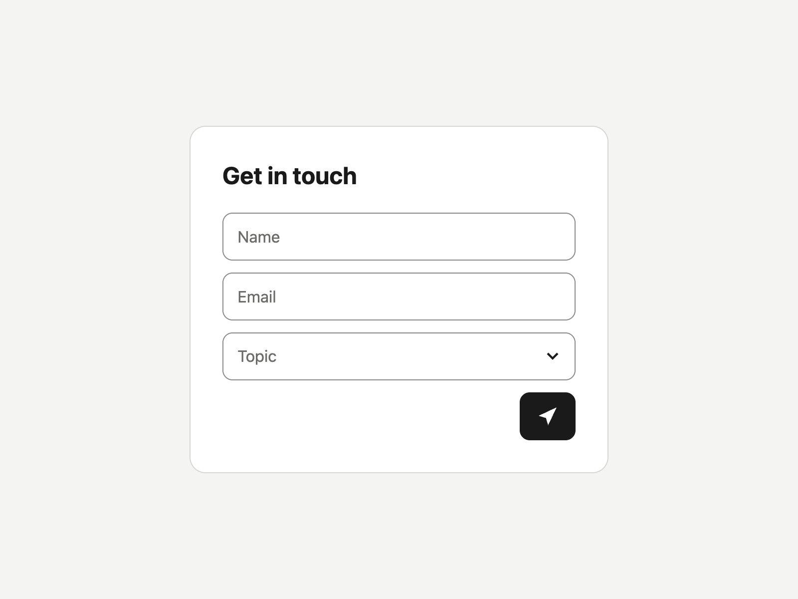
Two forms that look identical. An AI agent finished one in four actions. On the other, it never found the submit button.
Summary
- Same form, same look, same task for an AI agent: one version built from divs, one from native HTML.
- The accessible version took four actions and zero guesses.
- On the div version, the submit button didn't exist in the accessibility tree, so the agent was stuck until it fell back to guessing from a screenshot.
- The fix is a few lines of HTML: labels, a native select, a named button, a form element.
I built two contact forms that look identical. Same name field, same email field, same topic dropdown, same dark arrow button. One is built the way a lot of teams still ship forms. The other uses the HTML the browser already gives you. Then I gave an AI agent the same task on both and logged every step.
On the accessible version, the agent finished in four actions without guessing once. On the other, it never found the submit button. The button wasn’t hidden. It just didn’t exist in the only map the agent was reading.
A note on the form
I’d never design this form. Placeholder text standing in for labels and an icon-only send button are usability problems before they’re accessibility problems. The hint vanishes the moment you start typing, and the arrow asks every person to guess what it does.
I used it anyway because a lot of teams ship it. Both versions share that exact look so the only thing that changes is the markup underneath. Version B is the minimum fix that makes the controls exist for an agent and a screen reader. It isn’t the form I’d build. That one is at the end.
Setup
The task, word for word: “Fill this in for Steve McGarvey, steve@example.com, topic Accessibility, and submit.”
Version A is div soup. Inputs with placeholder text and no labels. A dropdown built from clickable divs. A submit control that’s a div wrapped around an SVG arrow. No form element.
Version B is accessible. A label tied to each input, visually hidden so the design doesn’t change. A native select. A button with aria-label="Send message". All of it inside a form.
Both versions share the same stylesheet. The agent was Claude driving a built-in browser that reads pages through the accessibility tree and acts on the elements it finds there. It can also take a screenshot and click by position. A small server logged every submission, so “done” means the data arrived, not that the screen looked right.
What happened on A
Here’s every control the agent could operate on version A:
textbox "Name"
textbox "Email"
That’s the whole form, as far as the accessibility tree was concerned.
The text fields worked. Chrome falls back to the placeholder as the field’s accessible name, so the agent saw a textbox called “Name” and one called “Email.” I expected placeholders to be the problem. They weren’t.
The dropdown worked by luck. “Topic” and its options showed up as plain text with no role. The agent’s first guess, clicking “Accessibility” directly, failed because that option was in the tree but not on screen. Its second guess, clicking “Topic” first, worked. Nothing ever said a selection was made. The agent inferred it because the text changed.
The submit button is where it broke. Searches for “submit,” “button,” and “send” all came back empty. Pressing Enter did nothing, because there’s no form to submit. Tabbing from the email field wrapped back to the name field, because neither the dropdown nor the arrow can take focus. Working from the accessibility tree, the agent was stuck, and the server log was empty.
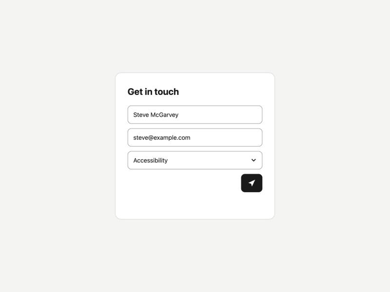
Then the agent switched to a screenshot, saw a dark square with an arrow, guessed it meant submit, and clicked its position on the screen. The submission went through.
What happened on B
One read of the page returned every control with a role and a name: a “Name” textbox, an “Email” textbox, a “Topic” combobox listing its options and which one was selected, and a “Send message” button. The agent filled three fields and clicked the button. Four actions. Logged on the first try.
The cause
Every failure on A traces to the same thing: the controls had no role, no name, or no state the browser could expose. In WCAG 2.2 terms, the arrow and the dropdown fail 4.1.2 Name, Role, Value. Neither can be reached by keyboard, which fails 2.1.1 Keyboard. The placeholder-as-label pattern fails 3.3.2 Labels or Instructions.
A screen reader user hits the same walls in the same places. The agent and the person are reading the same tree.
The minimum fix
<label for="email">Email</label>
<select id="topic" name="topic">…</select>
<button type="submit" aria-label="Send message">…</button>
<form method="post" action="/submit">…</form>
A real label per field. A native select instead of divs. A named button. A form element, which gives you Enter-to-submit for free. The visual design didn’t change at all, which is the point of the test and also its catch. B still carries every usability problem in A’s design.
The form I’d actually ship
<form method="post" action="/submit">
  <label for="name">Name</label>
  <input id="name" name="name" autocomplete="name" required>
  <label for="email">Email</label>
  <input id="email" name="email" type="email" autocomplete="email" required>
  <label for="topic">Topic</label>
  <select id="topic" name="topic" required>…</select>
  <button type="submit">Send message</button>
</form>
Visible labels that stay put while you type. A button that says what it does. Nothing for a person or an agent to guess.
Try it yourself
Both versions are live on this site: version A, div soup and version B, accessible. Point your own agent at them with the same task, or open your browser’s accessibility inspector and compare the two trees. View source shows everything.
The only change from the tested copies is what happens on submit. There’s no server here, so each form shows what it captured instead of sending it anywhere.
Limits
This was one agent, one form, and one run on each version. It’s a demonstration, not a benchmark.
The agent ran on the same model that built the page. It worked only from what its tools returned, but it couldn’t forget the source. A cold agent might guess worse, or better.
Agents that read screenshots behave differently. The screenshot fallback got A submitted by reading an arrow as “submit.” That works on a familiar icon and fails on an ambiguous one, and you don’t get to choose which icon your customers’ agents meet.
Tools differ too. This one exposed the hidden dropdown text, which is the only reason the topic guess was possible. Others may not.
What it shows
The accessible version took four actions and no guesses. The div version took thirteen steps, three failed guesses, and a switch to reading pixels before it went through. The difference is a few lines of HTML that cost nothing to write the first time and cost every agent, and every screen reader user, every time after.
That’s agent debt.